Wednesday, 13 March 2013

VS Pro and Galactica shoot


In this post I am going to discuss my final shoot which was for VS Pro and Galactica which is going to be the theme for autumn’s limited edition.

VS Pro

I chose Sintija as my model as I have worked with her before I know she has flawless skin and I felt her fair blonde hair would be perfect for the Victoria’s Secret. Inspiration for this look is shown below.

-->
On the photo shoot I felt that the images of Sintija were working really well and I was happy with her poses and facial expressions on the shoot. However, when looking at the images on the mac and reviewing them with my tutor I found that in most of the shots Sintija had her mouth slightly open and it looked as if she was snarling. This made it very hard to choose an image where her face had a softer expression. In hindsight I should have asked the photographer to hook the camera up to a mac so I could have a closer look at the images and been more particular about the facial expressions.

Below shows the image I plan to use in the look book for VS pro. I chose this image because the makeup is very clean and natural, the skin looks flawless and there are no bags or dark circles under the eyes. Making it an ideal image to advertise foundations, highlighters and concealers. I chose to do the hair myself in the image, as I knew that Sintija had very thin, soft hair that was easy to style. I feel that the loose bouncy curls in the hair complement the natural makeup. I chose a plan black bra for this look because I feel that VS Pro is all about the essential products focus on getting the perfect base. Therefore I wanted to use a plan black bra, which is an essential. Below shows an un-retouched image from this shoot originally very cold so i needed to warm up the image I chose to use in  Photoshop
However, I feel that even though Sintija has very fair skin, this is something that I could have warmed up slightly when I was applying the makeup. This is something I didn’t do because I was consciously aware of making Sintija look too dark and unnatural.  I also feel that I could have used a touch more colour on the eyes and lips to bring the look to life a bit more. Overall, I am very happy with the image I have chosen and feel that it looks youthful and natural, which is perfect for advertising VS Pro products.
-->

 Galactica 

The second theme I shot for this look was Galactica in which I shot two looks for. For this theme I took inspiration both from very clean and luminous makeup with silver highlights and from images with a jewel toned colour palate. This has been shown in my Pinterest wall for this look. Pinterest 
The makeup for this first look was inspired by the reflective silver and white on an astronaut’s suit and the dusty grey colours of the moon. It is also in line with the metallic beauty trend. Below shows my storyboard for this look.
 
-->


-->
The makeup for this look shows a Makeup clean skin with a luminous silver shimmer across the cheekbones and a pale pink blush on the cheeks.  With soft silver eye shadow across the eyelids and in the corner of the eyes to high light the eye and a very thin black eye line on the upper eyelid. Slight contouring with a beige/brown across the eyelid and cheekbones. The lips are covered with a nude gloss with a touch of silver in the middle. I have kept the hair in loose curls with it swept away from the face. I love the outcome of this image and feel that the silver shine across the cheekbones and eyes really works for the galactic inspired theme. I think that by using the wash of silver across the face communicates the theme but not in an obvious way. I also like the crop and feel by just having a head shot for this image gives it more impact. 

-->
The second look for this theme focuses on the colures of the galaxy, which I put together to create a jewel tone eye. I avoided recreated the pattern of the galaxy on the face because I felt it would be too obvious. Below shows the inspiration for this look. 


-->
I love the makeup for this look and feel that all the colures blend well together to create a wearable and achievable look. Throughout this project it has been important that all the looks are wearable and achievable for customers when buying the Victoria’s Secret products. I like the way the hair looks slightly wind swept and falls on the models shoulders. I am also pleased with the bra used in this shot, although it is plan I love the way the colour of the bra matches the colour of her eye shadow. I feel that the contouring across the cheekbone could have been blended in more as I can see a visible line across the cheek. This was the third look in the shoot and after reviewing and discussing the images with my tutor; it was advised that I should do three looks in one shoot as the model has begun to look tired. This is something I agree with, as she is not looking as fresh faced as she was in the first look. However, I was working to a tight schedule to finish all my looks before Easter, which is what I have done. But this is something I will keep in mind not to do for future shoots.

Tuesday, 12 March 2013

Dream Angels and Scarlett Noir shoot

-->
In this post I am going to discuss the shoot for Dream angels and Scarlett Noir, which is winter’s limited edition theme. I chose Laura as my model for this shoot. Laura is an amazing model who I have worked with before. I chose Laura because she has a beautiful face that fits the Victoria’s Secret brand image and she takes direction really well. Laura is also familiar with the Victoria’s Secret brand, this is something I have asked all my models before shooting them, because I feel if the models are familiar with the brand it really helps when shooting as they know the sort of look/poses I am going for. Laura is a red head; this is something that made me apprehensive about shooting her because there is not any red head models that model for Victoria’s Secret. However, as this beauty collection is exclusive to the London stores and there are many fair, red headed people in England, I feel that it will be appropriate and will also appeal to the target market.

  -->
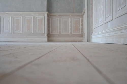
As this shoot took place on a Sunday I was not able to use the studios at Uni, so I booked the space RE-SO to shoot in. I chose RE-SO to shoot in because it is a wide-open space with plan walls and great natural light that comes in from the window. I wanted to have a space with a blank backdrop because it is how I have shot all my other looks. I made this decision because I all the looks to focus on the makeup, the bra’s feature in the shot as an extra and are used to relate the images back to the Victoria’s Secret brand. I felt that if I were do location shoots it would just be too much in the shot and take the focus away from the makeup. I also felt that the skirting boards going around the space added a romantic, vintage feel to the space. This is something I felt worked for the themes I was shooting, Dream Angels and Scarlett Noir, both have an element of romance in them. 

-->
As well as Laura as my model I felt I had a strong team for this shoot. I worked with Besiana as my photographer as also shot the second look for my Grecian Goddess theme. I like working with the same photographers throughout this project because I feel that they become familiar with the brand and my vision for the images. I also had a hairstylist who I met on another shoot I worked on as part of the team. I decided to ask a hairstylist for this shoot because I know hair is my weak point and has been throughout this whole project. I wanted to try some different hair styles out for these looks which I knew I wouldn’t be able to do myself and I knew Laura has very long, thick hair so felt it was better to get someone who is talented at hair to style it. In reflection, I felt this was a really good decision and made a big difference to the images. It also took some pressure of myself, as I was able to focus more on the makeup.

Dream Angels

-->Below shows the storyboard made to use as reference on the shoot for my team and myself. Dream Angel’s is line of lingerie and perfume that is currently part of the Victoria’s Secret brand, so this gave me clear guidelines and a strong vision for the theme. I kept with the pretty and romantic feel of this theme by keeping with pastel colours, loosely curled flowing hair and soft and feminine poses. I was very happy with the result of this shoot, however I feel I could of added slightly new element to the theme to introduce a different and innovative take on the theme. 

  -->
For the Dream Angel’s shoot I applied the look that I had previously tested. I kept in mind the criticism from the last Dream Angels shoot of making it look dated by bringing the colour up to the brow bone, so I was sure to only put the colour on the eyelid. I used a brown liner across the upper lash line rather than black, I felt that this worked really well to soften the eyes. Using the same colour blush, eye shadow and lipstick really worked for this look. I feel that all elements such as the hair, makeup and bra complemented each other and worked harmoniously together in the images. I love the poses in these images I have chosen. I like they way each of them are shot a slightly different angles, given a different view on each image. They poses are very soft, feminine and romantic but, without looking timid. The model still eludes confidence and sex appeal however in a more subtle way in comparison to the Very Sexy theme. I love this about these images because the image still commands attention but in a different way and I feel that this image will evoke different emotions and reactions in viewers than the Very Sexy theme.

 
Scarlett Noir

--> 
The second theme I shot for was Scarlett Noir, which is winters limited edition theme and I created two different looks for this theme. Below shows the storyboard of inspiration I created for this look. 


-->

The first is clean and fresh look with a red/black glossy coloured lip, I wanted the lip to have a gloss over it to make the colour look patent. I wanted this look to have a whimsical and romantic feel to it so I asked the hairstylist to create a large thick plait going across the head with wispy bits of hair coming down. When I finished this look I loved it, it had the whimsical and romantic feel I wanted with a gothic edge. I knew it was slightly more edgy look than Victoria’s Secret would usually do but I felt it would work because it still had sexiness to it when paired with the bra. My aim for this project was to offer a new element to their beauty line by introducing these collections, as well as to keep with the brand image. However, when I started to shoot this image I found that the bra and the dark lips did not go together well at all and were communicating two completely different thing. The dark lips are communicating a slightly gothic look whilst the brightness of colours on the bra is communicating a much more feminine and playful look. With this in mind I expressed the problem to my team and asked the photographer to shoot head shots for this look. Immediately I saw a change in the image and they worked really well with this crop, I feel that this headshot is both elegant and sexy and portray the theme. Whilst the hair adds a softer element and balances out the harshness of the lips.


--> After discussing this look with my tutor she said that the lips were too dark and harsh for Victoria’s Secret and it is not something that their customers would wear. After hearing this opinion and having a second look at the image I agreed with this view and decided to change the lips in post-production to a more pink toned lip. I feel that this works well as it doesn’t stray to far from the theme but ties in much better with the Victoria’s Secret brand. I chose this image because I love the way Laura is looking over her shoulder at the camera. It is sexy and elegant an she is still looking at the camera and therefore will engage with the viewer. This is also not a pose that has been done throughout my shoots. I also chose it because the straps are in the image, which, suggests a bra and in turn relates back to Victoria’s Secret. I have also changed the colour of the straps to match the lips, as it was previously too bright
  -->
The second look for this theme is all about the eyes. I have kept the skin the same with nude lips and a brown/beige smoky eye. I decided to do the smoky eye in brown shades because I felt a black smoky eye would be too obvious for a gothic inspired look and I had also used a black smoky eye in previous looks for the project. I was inspired for this by makeup at Valentino A/W 2012-2013 show that featured a sculptured eye using taupe shades. My storyboard for this look is shown below.

For this look I asked the hair stylist to keep the hair down in loose waves with a weave style plait either side. I chose this hairstyle to offer the viewer an alternative to having the hair up but kept the plaited element to ensure the looks still relate to each over. I like the angel of Laura’s body in this image and the way she is touching her hair. I think that the brown shadow contrast really well against the blue in her eyes, so they really engage with the viewer. However I feel that I should of blended the shadow more into the eye sockets.  I like the motion of her hair in the shot but I think that it would of looked better if it was curled more at the ends and if the plaits were pulled away from her face so much. Overall I am very happy with how this shot has come out and am pleased that I was able to include the bra in the shot, but I would of made these small changes to the eye makeup and hair if I were to do it again.


Saturday, 9 March 2013

Test shoot for Dream Angels


--> As I plan to re-shoot my look for Dream Angel I am going to take a different to the makeup for this theme, as in the first shoot the purple and lilac eye shadow looked very date and did not work. For this look I have taken inspiration from Dior’s S/S 2013 Cherie Bow collection and Chanel’s S/S makeup collection.
  --> In the advertisements both these brands featured a pretty, soft palate, made up of creams and pastel pinks. I feel that this is a much better way of utilizing the pastel palate, as it is a colour that will not date and appears more natural on the skin. -->


On the Dior campaign they have matched the eye shadow, blush, lips and nails. This is something I plan to do for my look because it is on trend and creates a sweet and pretty look which will fit with my vision for the dream angels theme. 
-->
Below shows the look I have created and intend to use for the actual shoot. I love using the same colours on the eyes, cheeks and lips because the colours work together to complement the features and it ties the look together. I realise that these certain colours do not work so well on Marissa’s skin tone but the model I propose to use has very fair skin so I know the colours will work well on her. On reflection of this look, instead of using a black liner I plan to use a brown/taupe coloured liner. This is because I think the black looks to harsh against this pink and by using a brown/taupe it will soften the eyes and fit in better for the romantic Dream Angels theme.
-->

Overall this test shoot for Dream Angels has been a very positive experience as I have a clear idea of the look I plan to do for this theme and how it will look. In turn I am much more prepared than I was for the last Dream Angels shoot in terms of what the makeup will be. 


-->


Thursday, 7 March 2013

Hindu Goddess Shoot

-->
In this post I am going to discuss the photo shoot for the Hindu Goddess theme and analyse the images I have chosen and retouched for the theme. Below is a link to the Pinterest wall I have created for this theme. I have also featured the storyboard I created for this theme to show my model and photographer, I always ensure I make these for the shoots so everyone in the team is clear in the vision for the shoot.

Pinterest wall


  -->

I chose Leah as my model for this shoot because I felt that the colours I planned to use and the bright yellow colour of the bra would really suit her skin tone. I also like the almond shape of her eyes. Zoe Rolling’s was the photographer for this shoot, Zoe is a photographer I have worked with several times previously, she shot the images for the first Grecian Goddess look which I was very pleased with. I always work well with Zoe and I like her fashion forward style of photography. I felt well prepared and confident about this shoot. 
 
-->
The focus of this first look was all on the lip and a beautiful base for the skin with a coral blush to match the lips. The makeup for this look was quite simple and I completed it within 40 minutes. This was good because I scheduled an hour and a half for the hair and makeup on this look. My original plan was to have a matte lip for this look, however I felt that this looked slightly dull and I wanted the lips to look more lustrous so I added a small amount of Vaseline to the top and bottom lip. Before shooting this look I saw Sharon, who advised me to add more warmth to the face because it was looking very cold. I added a gold highlighter to the face along the cheekbones and across the forehead. This really warmed Leah’s complexion and looked beautiful on camera. I planned to style the hair in a low pony tail for this look, I was aware that when doing an up-do on the Grecian Goddess shoot with Alexa it didn’t work so well. With this in mind I ensured that I had loosely curled hair coming down to frame the face. I felt that this worked particularly well with Leah’s face shape. I also wanted to keep the hair simple for both the looks for this theme because I am placing tikka’s to come down onto the forehead. I feel that these were a positive addition to the look as it relates back to the Hindu Goddess theme without looking too obvious. These are traditional head pieces I brought from an Indian dress shop in St Marys, I am glad I made the decision to buy the traditional head piece, rather than buying a necklace from a high street store, because this looks more genuine. Whereas if I had brought a necklace from a high street store there was a risk of it looking cheap and not sitting well on the face. Overall I was very pleased with this look. I chose to use this shot as I feel that the face looks very strong and I like the way the hair falls down the face. The bra fits Leah really well and the colour has come out well on camera as well as suiting Leah’s skin tone. However, Leah has a more muscular shaped body with broader shoulders and I feel that this pose makes her appear slightly masculine. This is not something seen in Victoria’s Secret campaigns as the models are all very slight and petite and elude femininity in order to sell the lingerie. Although I have slightly altered her body shape in Photoshop I feel that she still looks too muscular. To solve this problem I am considering cropping this image to make it a head shot as the face is very strong in this image. Upon reflection I feel that I should have been more particular when choosing my model for this theme. In shoots to come I will look for someone with a more slender body as well as a good face. 

 
-->
For the second look I created a blended smoky eye with a hint of colour in it. This was a look I first experimented with in the test shoot, which allowed me to know what worked and what didn’t. For instance I have created a slightly cleaner eye than I did previously in the test shoot. I felt the eyes in the test shoot looked slightly like panda eyes on camera. I kept the skin the same as in the previous look as I felt this worked really and looked great on camera. For the lips I felt that a soft pink would go well with this look. I carefully chose the headpiece to bring out the eye shadow I have used. At first I was concerned that the headpiece would be slightly to big and over power the makeup, however I think it works and I love how the colours in it complement the colours used on the eyes. I didn’t have a clear vision for the hair for this look, I just knew that I wanted to keep it down. Leah has very long and extremely thick hair, which did make it hard to style and after curling it all it looked very frizzy which I knew would not work. With this, I decided to minimise the amount of hair by tying half of it back and clipping one side behind the ear. I feel that the hair works in this shot by the way Leah’s head is turned to the side and falls nicely. However, if I was to re-do this shoot I would of made sure to manage the hair better so I could have had it all down. I love the pose in this shoot and how Leah’s head is turned to the side as it shows of her jaw line and cheekbone and think that it creates a completely different look to the first image. 


-->
Overall I am pleased with that shoots, I feel that things that work are the bra, the headpieces and the makeup looks I have created for each look. However if I was to re-do this shoot I would have prepared the hair more and been more aware of Leah’s body shape and experimented with different poses that would of made her body look less muscular.

Tuesday, 5 March 2013

Second Shoot for Grecian Goddess


-->
In the post I am going to discuss the second shoot with model Alexa, for the Grecian goddess theme. For this photo shoot shot the second look for this theme. The inspiration and direction for this look is shown below in the storyboard I created for my model and photographer. 


-->
As I only had one look to do for this shoot I knew it would not take as long as the others had previously done. I aimed to get the hair and makeup done within an hour and a half, which is what was achieved. I felt that this look would take me less time because I had already worked with Alexa I was familiar with her face, so I knew what colour foundation to use on her and what sort of makeup would suit her eye shape etc. This allowed me to finish the look in a shorter time. Although I did not do a test shoot for this look, in reflection I feel that doing a test shoot would have been even more beneficial as I would of know exactly how long the look would take me.

The hair took more time and was slightly more difficult than I anticipated. I planned to do a messy up-do however this is something I had not practiced before hand. If I could do this again I would have practiced and tried out different hairstyles prior to the shoot. I ended up pinning the hair into a loose bun at the back head. In hindsight I would of done this style differently by pulling more of the hair out of the bun so it loosely falls and frames the face so it looks more like a messy up do.

Working with the same model for this theme was great as Alexa already understood them theme and the sort of look I was going for, so was able to go straight into the poses. I worked with a different photographer for this photo shoot, this is something I was apprehensive about because I was not familiar with her style. I was worried that these images would look completely different to the first Grecian Goddess images. However I showed the photographer my storyboard and explain what my vision for this theme was. The lighting in this image is slightly brighter with a stronger contrast, however I feel that this works well for the look as it makes the eyes stand out and complements the colour of the bra.

The poses I was aiming for in this look where slightly more intense in the eyes with the head gently tilted to the side to show the jawline and cheekbone. I aimed for a strong look without coming across to angry or stern. For the makeup I have focused more on the eyes and lips and have a high shine gloss effect over them. I considered using gold leaf for this look, however after having talks with my tutors I decided against this. This is because gold leaf is not a product that will be sold within the Victoria’s Secret collection and by featuring it in the images people may assume that it is part of the collection. 

 Below shows the two retouched images I chose from this shot. Originally I planned on using the first one.

I love the crop, Alexa’s body looks great and the bra looks beautiful. I like how Alexa’s held is tilted forward slightly and the sheen on Alexa’s skin which creates a golden glow. After discussing this with my tutor it was decided that this image would not be the best for my look book because of the hair. The hair is all pulled back which doesn’t suit Alexa’s face shape very well and it is not right for the Victoria’s Secret brand as they are always shown with loose flowing hair.

Instead I plan to use the second image. This image works well because even though Alexa’s hair is still pulled back you can see the bun at the back, which gives it more shape. I feel that the pose eludes and effortless, otherworldly beauty, which works for the theme that is based around goddesses. Again, the skin has a beautiful sheen to it and I love the blend of the gold into the black. However, on reflection I would of bended the black eye shadow more so it doesn’t create such a harsh line.